Plibl
Logo, Branding, Packaging
Medication that doesn’t feel like medicine.
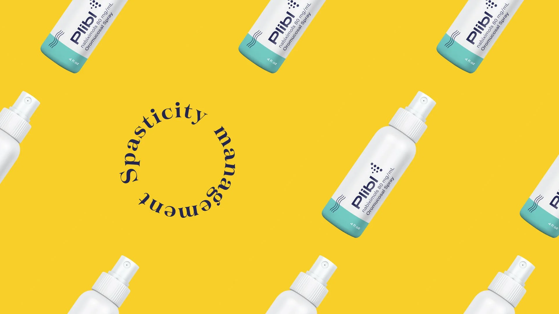
While at Avalere Health, the company was approached by Greenwich Pharmaceuticals with an exciting opportunity to develop the identity for their new product, an oral spray targeting spasticity, a condition that causes the muscles to contract uncontrollably.
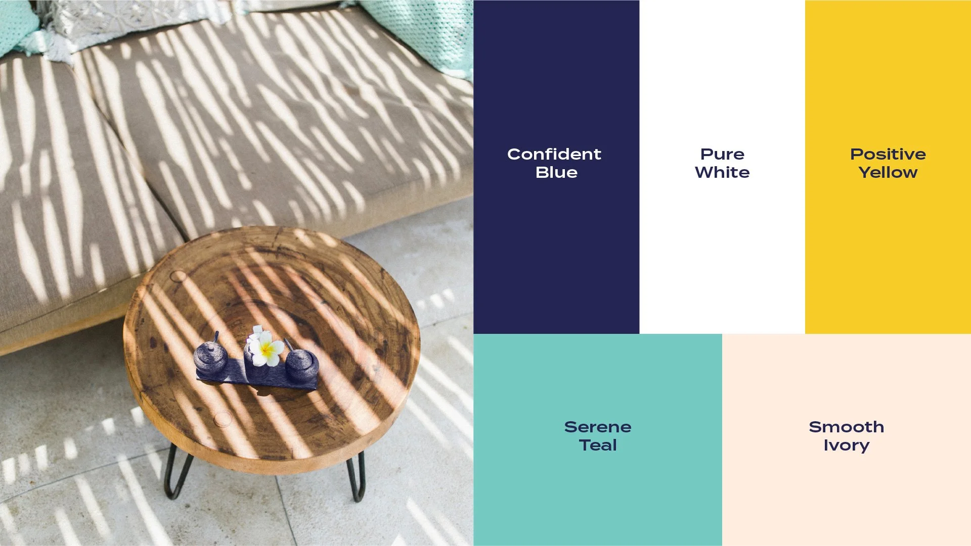
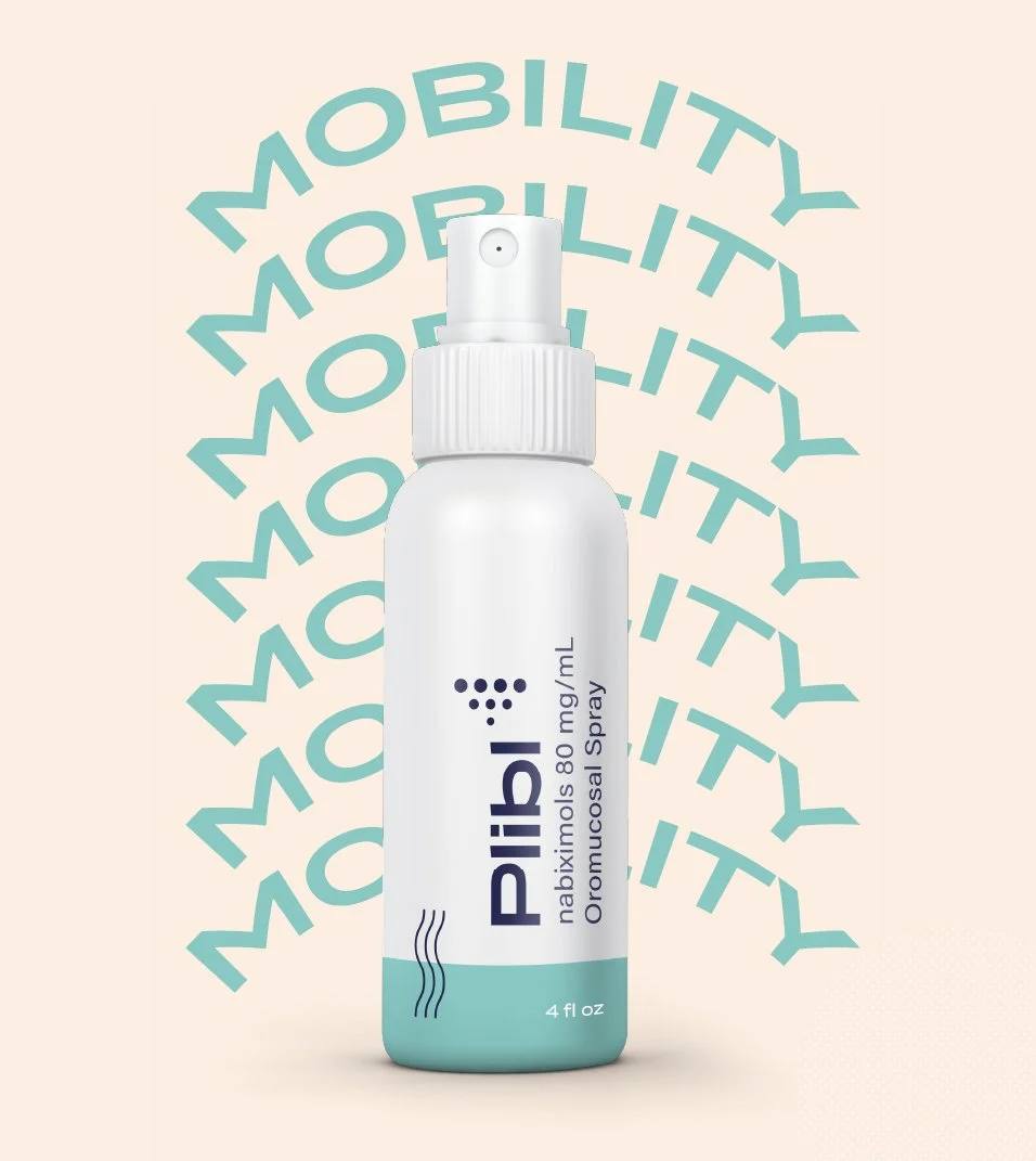
Flexibility, comfort, and control were the themes we chose to communicate as they directly addressed the main pain points of patients. These ideas heavily influenced the visuals and messaging.
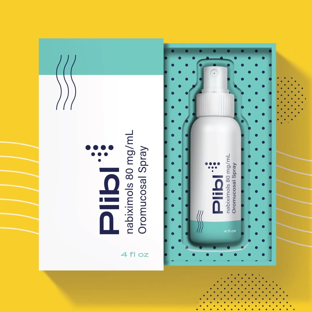
Part of the challenge was to explore a delivery method that didn’t look or feel like taking medicine. Patients using similar oral spray products did not like how it called out there need for medication. We set out to design a product that seamlessly fit into patient’s lives by providing a more desirable look that wasn’t recognizable as medication.