Aponvie HCP Website
Web Design, UX
No campaign? No problem.
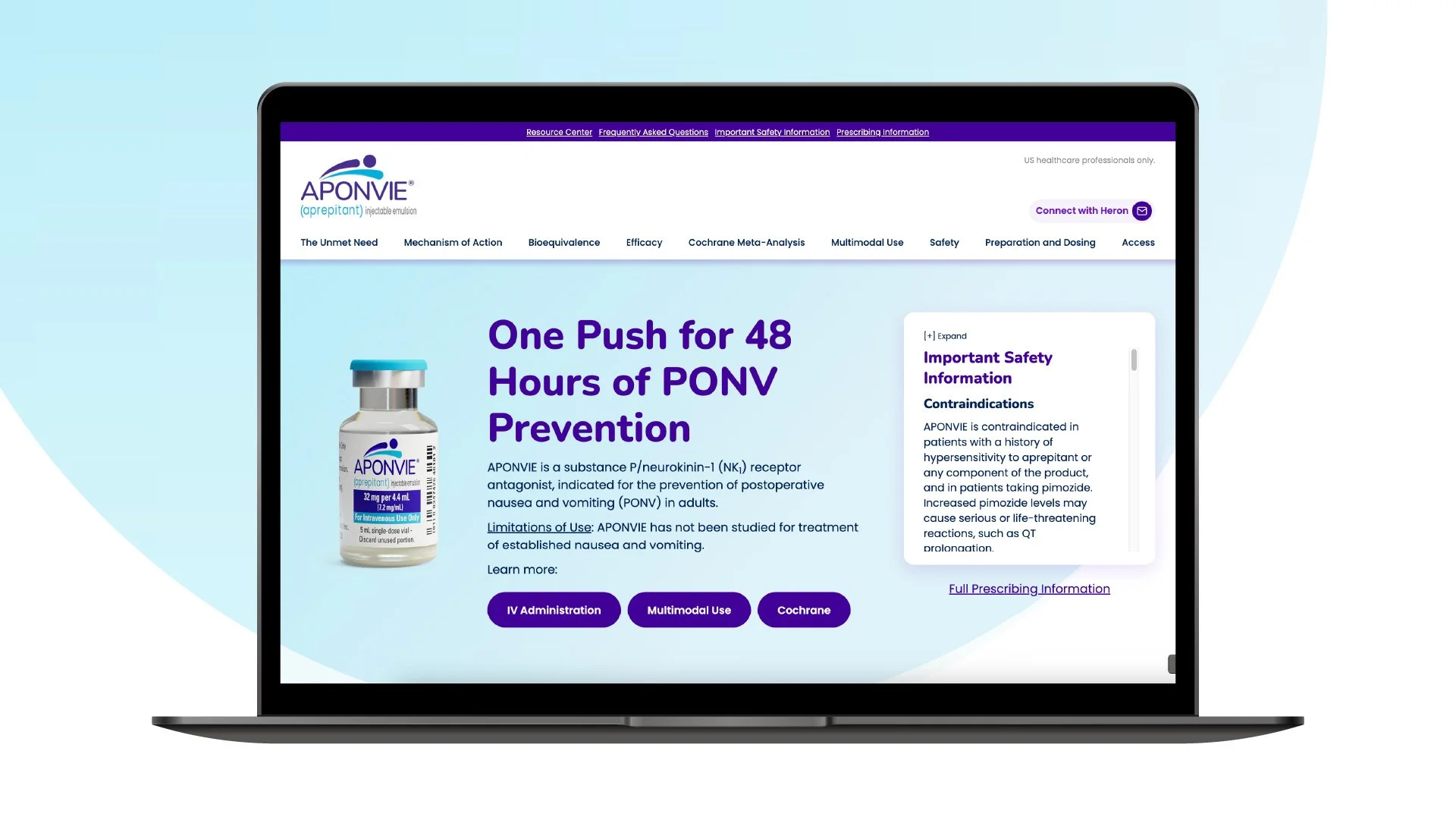
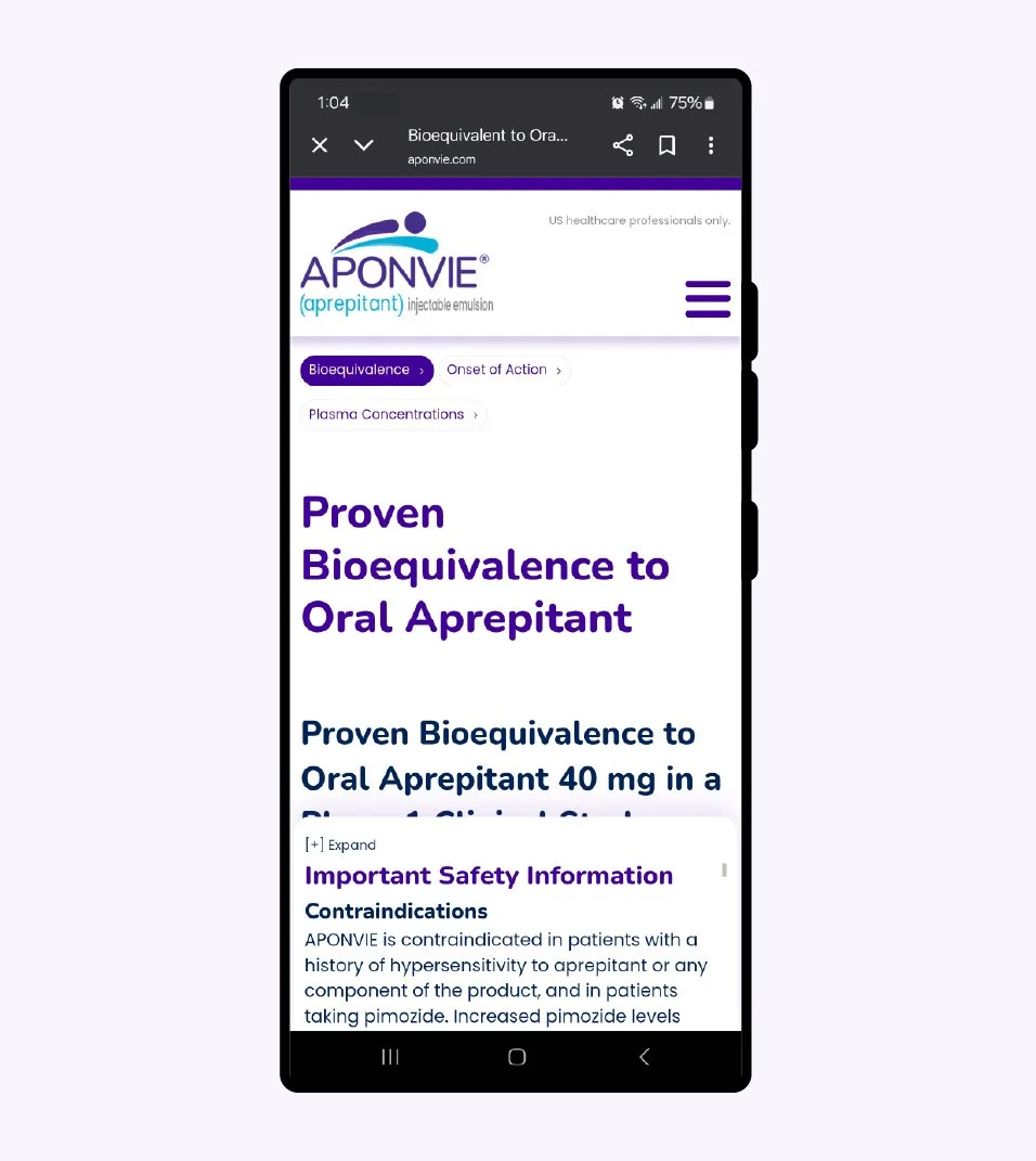
Heron Therapeutics needed a website it’s post operative nausea prevention medication, Aponvie. At the time, there was no active campaign promoting the drug and limited budget for a website, so visuals needed to be kept simple and centered around the brand mark and color palette. Additionally, this product came with a large amount of clinical data that would need to be presented in a easy to navigate and digest format.
The efficacy information included several complex visuals of charts and tables, sometimes needing to be displayed in tandem with one another. After market data revealed most of the clients target audience uses a desktop/laptop to do product research, the team prioritized layout for larger screen sizes. It was decided to depart from the standard “tray” approach for ISI and instead used a floating container on the right side of the screen. This allowed for more space to present clinical information while maintaining fair balance standards.
While the layout allowed for more content to be visible on screen at any given time, some pages were still very content heavy and hard to navigate. This prompted the implementation of a secondary navigation at the top of the screen that allowed the users to quickly jump from section-to-section and easily navigation the robust content.